RoadWarrior Website

Context
Problem
Goal
Timeframe
Sep 2022 - Jan 2023
RoadWarrior is a powerful route planner used by tens of thousands of professional drivers and dispatchers. It is available as a mobile app, used mostly by drivers, as well as a web platform used by dispatchers.
The old RoadWarrior website was in need of a massive redesign. The website needed a strategy and content revamp as well as an aesthetic refresh.
With this redesign, I aimed to help new customers understand the powerful capabilities of RoadWarrior and how it can help them in their line of work. We aimed for at least a 25% increase in RoadWarrior subscribers through this redesign.
Deliverable
My role
Lead Product Designer on a team with a Project Manager, Product Owner, and several developers
Overview
RoadWarrior is a route optimizing navigation platform available both as a phone app and a web app.
RoadWarrior has over 500,000 platform downloads, used by both solo drivers and fleet dispatchers.
I worked with the product owners of RoadWarrior to work through their goals and objectives, then created a storyboard and personas based on the conducted research.


Identified website problems
The old website needed upgrades primarily in the following areas:
include persuasive content and rewrite copy to have less jargon
📝
research showed users wanted to see more screens in action
📲
the old pricing page is confusing and difficult to process
💰
new blog landing page and blog article layout needed for the revamped blog
✍️
inform “how it works” and key highlights for different user groups
🔑
instead of confusing users with both app links and web app links, funnel users to the sign up flow link to flex, then redirect them to their applicable platform
🛣️
new visual design to keep the experience light and engaging
🎨
Wireframes & Content
I created wireframes for all pages on Figma and updated them iteratively based on feedback from other designers and the project manager.

Content updates
The old website used a lot of jargon and copy that was not relatable to most users. It also needed to be more engaging, clear, and succinct.
I worked with my team to workshop the content and ensure I hit all of the points accurately.

Hero content on the old site homepage is not clear on what RoadWarrior is or how it can help

Improved homepage hero content on the new site

An example of the old site's jargon-y content

Improved version of content on the new site
The website also needed more persuasive content that provided social proof and highlighted key features that the platforms provide.
For this purpose, I gathered real testimonials, download and rating numbers, and clearly showed specific features for both the app and web app.

I gathered a handful of the reviews directly from the RoadWarrior App Store page and sprinkled them throughout the website as well.
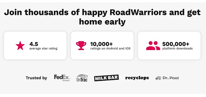
I highlighted the average star rating, number of ratings, platform downloads, and brands that trust RoadWarrior.

I wanted to highlight exactly how much time and mileage a RoadWarrior driver saves compared to when they use Google Maps with this case study.

These three primary details sets RoadWarrior apart from competitors, so I put them front and center on the homepage.

Research showed what drivers value most, so I made sure these were emphasized in the Drivers page.

Research showed what dispatchers value most, so I made sure these were emphasized in the Teams page.

Old website's pricing page had a confusing and difficult to read pricing table.
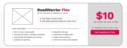
New and improved pricing page includes just one pricing card and $10 a month highlighted.
Final Mocks & Outcomes
Goal: apply branding and create illustrations to transform wireframes to aesthetically pleasing prototype

I created illustrations using Illustrator that matched RoadWarrior branding and gave a friendly, welcoming outlook of the product.
🎬 Final mocks
Old website homepage

New website homepage

Old drivers page

New drivers page

Old teams page

New teams page

I worked with the engineers closely during the entire development process.
I conducted many rounds of QA and answered any and all questions/comments the engineers left on the Figma mocks.


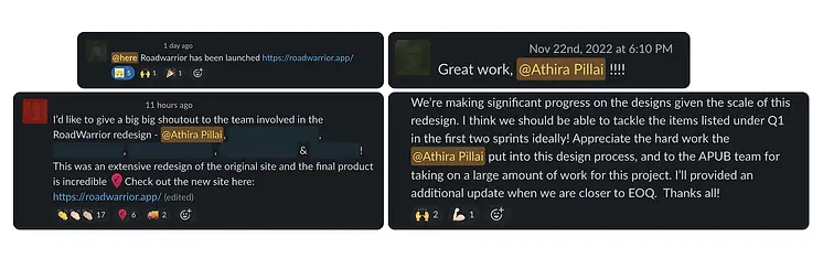
The new website is currently live on roadwarrior.app
Outcomes
The RoadWarrior website redesign was a huge project that took months of strategy, planning, design, and development.
I was able to lead the design of the entire website and grew immensely as a designer, but teamwork and collaboration made the project run extremely smoothly.
I applied and gained many valuable experiences and skills with this project.
🔑
make key design decisions as the sole product designer on a large redesign project
♿️
checking color contrast, adding alt text when appropriate, providing accessible link text, etc., to put accessibility first
🎨
create a set of illustrations with a unique style that enhances the rest of the new design branding
📢
brushed up on my UX writing skills to narrow down the specific tone of voice and feature content we want to include
🔒
streamlined developer handoff and communication to make development process efficient and effective
✨
innovated new ways to simplify and enhance the user journey from start to finish
Since the new site launched, we have seen a boost in RoadWarrior subscribers and revenue.
