Wix Accessibility Thesis

Context
Problem
Goal
Timeframe
Aug 2020 - May 2021
As the web becomes an increasingly popular place for people to share their ideas, products, and services with the world, website building platforms are a common solution – Wix is the most popular hosted solution technology with almost 6 million live websites, followed by Squarespace with 2.6 million.
While these website building platforms are gaining popularity, the novice web designers who use them are unlikely to know how to make websites accessible. This not only cuts out a large portion of the population from being able to use their website, but also exposes the site owners to website accessibility lawsuits.
For my master's thesis, I assessed the current state of this problem and then conducted user research to design several accessibility solutions that Wix can implement into their website editor.
Deliverable
Thesis paper for conferences; defense presentation
My role
UX Designer and Researcher with support from my research advisor
Process


Accessibility Audit
Goal: to assess current state of accessibility in live Wix sites
I audited 30 websites, or 90 pages, total.
This included 10 blogs, 10 small businesses sites, and 10 eCommerce sites.
Four primary guidelines were checked:
-
Image alternative text
-
Heading structure
-
Color contrast
-
Link text
The sites were checked using WebAim WAVE and manual testing.

Results of one of the audited blog websites created using Wix
Accessibility Audit Results

Common image alt text issues across all sites:
-
File name often used as alt text
-
Social media icons have at times ineffective default alt text
-
Product images and gallery images have redundant product/image titles as alt text
-
Nearby product images all have same alt text as product titles
Common heading structure issues across all sites:
-
Many pages often have missing H1 tag
-
Somewhat random heading structure on many pages


Common color contrast issues across all sites:
-
Placeholder text in form field are often too low contrast and without labels
-
Many navigation menu options do not have enough contrast
Common link text issues across all sites:
-
Blog-wide "log in to leave a comment" link issue
-
Contact forms have "Send"/"Submit" link that could be improved as "Send message"
-
Informational alert when adding button text gives "Learn More" as example

Interviews
Goals: understand awareness of accessibility and gain insights for solutions
After recruiting participants from multiple avenues, I interviewed 10 people in total, 4 of whom were the creators from websites included in the accessibility audit.

I wondered...
-
how do I craft these interview questions carefully? I want to make sure the interviewees understood I was not faulting them for not knowing about accessibility beforehand, that Wix should have provided ample accessibility resources.
-
I also wanted to make sure my interview requests and waiver forms were crafted carefully to avoid any indicators that the study was about accessibility - to avoid the interview participants looking anything up beforehand.
Collaboration and feedback from my advisor along with pilot testing helped me answer these questions.
After a pre-interview demographics survey, the interview was done in three parts:
1. Wix and accessibility
-
likes and dislikes of Wix
-
overall experience with the Wix editor
-
knowledge of accessibility
-
awareness of Wix accessibility resources
2. Insights into accessibility solutions for Wix editor
3. Audit results - I provided the interviewees with the opportunity to receive the results of the accessibility audit for their website along with tips on how to improve their site accessibility.

I said "accessibility" about 14 times in each interview.

I used Miro to conduct a thematic analysis with the interview transcripts.
From the thematic analysis, three themes were uncovered:
✨ Website builders offer an engaging experience for novice web designers
An intuitive interface increases usability
Many features provide a supportive environment
Customization fulfills
creative freedom
🧭 Clear accessibility assistance will lead to success
Website builders can offer accessibility education with walkthroughs
Novice web designers desire more automated guidance and accessibility panels
👀 Accessibility features are undiscoverable but desirable
Accessibility is often not considered during the design process
Unawareness of website builder accessibility documentation and features
Novice web designers want to make accessible websites
Prototypes
Goals: create low-fidelity and high-fidelity prototypes using interview insights
From the interviews, I gathered four prototype solution ideas.
I used Procreate on my iPad to draw up wireframes for each solution.
Solution 1️⃣
Accessibility wizard on side menu
"So even suggestions, a tab or a guide [that] had tips to make your website accessible, would be very helpful." -P6
"I will obviously prefer having a visible section for [accessibility]. When I click it, there should be onboarding tutorials of how I can leverage all the accessibility options that they have." -P8


Solution 2️⃣
Accessibility notifications for each element added
"While you're actually going through the process of populating a template, a pop up [that's] smoothly integrated [would be ideal]. As I'm uploading images, it could probably do a better job of encouraging me to use alt text." -P5
"While doing so the website can notify me that, okay, the contrast there is a low contrast ratio between the two. And then I can quickly change it; they can also suggest to me, maybe if it's possible, like what are the best colors for that" -P10

Solution 3️⃣
Pre-publish accessibility panel + walkthrough
"Your Publish button [should be] just disabled, because that should be the standard - you shouldn't be allowed to make websites that aren't accessible." -P7
"Definitely at the end, there should be a part asking them okay, let's walk through your website through this accessibility testing software" -P3

Solution 4️⃣
Accessibility settings button for each element in its mini-menu
"Now, if you add an image, you will get a list of icons. So maybe that first icon should be of accessibility or something. That's something that should be included in that list. " -P8
Current Wix mini-menu for each element

🤔 At this point, I asked...
-
Should the headings notification have generic labels (H1, H2, H3) or be more of an example (Trees, Types of trees, Oak)?
-
Should the pre-publish accessibility check be mandatory in order for people to publish?
-
Should these notifications be dismiss-able?
-
Are there other nuances that I'm missing?
Collaboration with my research advisor again proved to be extremely helpful with figuring out these nuances.
After a productive working session to answer these questions and make several design decisions, I created high-fidelity screens using Figma.

Solution 1: Accessibility wizard on side menu
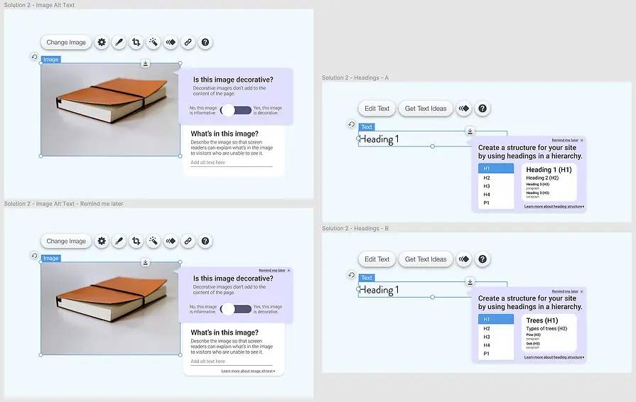
Solution 2: Accessibility notifications for each element (image alt text and heading structure)

Solution 2: Accessibility notifications for each element (color contrast, button text, link text)

Solution 3: Pre-publish accessibility panel (left) and Solution 4: Accessibility button in mini-menu (right)
Surveys & Outcomes
Goals: to get brief feedback on hi-fi screens and improvements for future iteration
I sent out a survey with each prototype and mostly open-ended questions to 5 of my interview participants.
Solution 1️⃣ responses:
Accessibility wizard on side menu


"I think this is a great add! I also like that you added it at the top. Many companies will throw this in as an after thought rather than at the forefront."
Solution 2️⃣ responses:
Accessibility pop-ups for images, headings, color contrast, and buttons/links

2 of the respondents mentioned that additional context about what makes an image decorative or informative would be helpful.
"I like the integration and how the prompt shows up while you are editing your site. It can be harder to come in after the fact and when you see your site as 'finished'."
3 respondents said they would prefer the generic labels (Heading 1, Heading 2, etc.) instead of descriptive labels (Trees (H1), Types of trees (H2), etc.), as it provides them with a visual comparison with the same words in the editor's text panel and is more industry standard.
"I am fine with the generic having a design background but I think the second solution may help individuals who have less formal education in design."


All of the respondents reacted positively to the color contrast pop-up.
"I think this is cool! I like that it gives me relevant options that I could use instead."
Respondents reacted positively to the pop-up that would appear for button and link text, but 2 respondents mentioned it may get repetitive if it appears for every button.
"The pop-up is useful, but can get annoying in after three-four times when I have understood the concept."

Solution 3️⃣ responses:
Pre-publish accessibility check panel

Survey data showed mostly positive reactions towards the pre-publish accessibility check panel, but hesitations towards making it mandatory.
"I would find this option very useful. I would try to incorporate accessibility changes during building of the website. Plus having an extra accessibility checker step will help me ensure that the website is accessible. I will always try and fix all the issues."
"I would not like the checker to be mandatory. It will make website development process very restrictive. There can be other reasons why I am publishing inaccessible website content."
Solution 4️⃣ responses:
Accessibility item in element mini-menu

Responses to including an accessibility item in the mini-menu of each element were extremely positive; it received the most positive remarks from survey respondents among all prototyped solutions.
"I like it and would find it to be helpful."
"This is the perfect place to add an accessibility button since you can edit other properties here as well so it goes with the flow."
Outcomes
I presented this information in my master's defense and received an A, and my work has been accepted in the ASSETS Accessibility & Computing conference.
Additional user research, interactive prototypes, and usability testing are all important in future iterations of this project, but these solutions have immense potential to boost the accessibility of websites created using website builders like Wix.

I had a lot of fun creating a retro-gradient theme to my defense slides.

One of the reviews of my paper resulting in ASSETS conference acceptance.
Lessons Learned
I learned quite a few lessons from the Wix Accessibility project.
Crafting interview questions and requests must be carefully done in order to effectively gather data and avoid bias.
-
When deciding what questions I would ask my interview participants, I needed to ensure they wouldn't spark any biases or take anything personally.
-
I also needed to craft my interview requests and waiver forms so that they would not mention anything about accessibility, so as to avoid interviewees from looking anything up beforehand.
Giving interview participants a chance to speak freely and openly about their thoughts can yield effective results.
-
I was able to gather many great ideas on accessibility features on the Wix editor in my last question - a simple "do you have any other thoughts on helping Wix users create more accessible websites?" - even though most of them had only heard of web accessibility an hour ago, they were able to provide key ideas as seasoned Wix editor users.
As always, collaboration and feedback are key.
-
I could not have completed this project without my research advisor's guidance and feedback. We met every week for collaborative working sessions, and I've learned that nobody accomplishes anything alone.